How to Frame Art Prints: A Complete Guide
Everything you need to know about framing art prints, covering everything from choosing the right frame color and mat to deciding between glass and no-glass, DIY or professional.
You've found a print you love. Now comes the part most people get wrong: the frame. A beautiful print in the wrong frame reads as an afterthought. The same print in a well-chosen frame becomes a deliberate statement: it commands the wall and anchors the room.
This guide covers every decision you'll face: mat or no mat, glass or no glass, which frame color works where, how to flatten a print before framing, and when it's worth paying a professional. By the end, you'll know exactly how to frame art prints to do justice to the work inside.
How Should Art Prints Be Framed?
The short answer: with intention. Every choice, from frame profile and color to mat width and glazing, should serve the art and the room it lives in.
Here's the hierarchy of decisions to work through:
- Choose the right frame size: the frame must match the print dimensions exactly, or you'll need a mat to bridge the gap.
- Decide on a mat: mat or no mat changes the entire feel of the piece.
- Choose your glazing: glass, acrylic, or none.
- Pick a frame color and material: wood, black, or white each sends a different signal.
Work top to bottom, and the final result will feel cohesive rather than assembled.
Mat vs. No Mat: Which Is Right for Your Print?
A mat is the bordered insert that sits between the print and the frame. It's often white or off-white, and it serves two purposes: visual breathing room, and physical protection (the mat keeps the print surface from touching the glass).
When to use a mat
- The print is smaller than your frame. A mat bridges the gap cleanly.
- The print has fine detail or delicate edges. The mat creates visual separation that helps the eye settle into the image.
- You're framing photography or fine art prints. A 2–3 inch white mat is classic gallery presentation and elevates almost any image.
- The room is formal or minimal. A generous mat (3–4 inches) with a slim frame reads as museum-quality.
When to skip the mat
- The print fills the frame edge to edge and you want maximum impact. Bold graphic prints (a striking pop art poster, a high-contrast noir silhouette) can be framed borderless for full visual punch.
- The aesthetic is casual or eclectic. Frameless or mat-less works well in gallery walls with many pieces at mixed scales.
Should Art Prints Be Framed with Glass?
Yes, for most prints, glass (or acrylic) is recommended. Here's why:
Without glazing, the print is exposed to dust, humidity fluctuations, and UV light. Over time, colors fade and paper yellows. Skipping glass is fine for short-term display or in very controlled environments, but it's not ideal for anything you care about long-term.
With glazing, the print is protected. The main options:
| Type | Pros | Cons |
|---|---|---|
| Standard glass | Affordable, clear | Reflects glare |
| Anti-reflective glass | Minimal glare, excellent clarity | More expensive |
| Acrylic (Plexiglas) | Lightweight, shatter-resistant | Can scratch, can bow in large sizes |
| UV-filtering glass/acrylic | Best UV protection | Premium price |
Practical recommendation
For prints up to A3, standard or anti-reflective glass works well and is easy to source. For larger pieces (A2, A1), acrylic is lighter and safer to handle. For anything you plan to keep for years (an heirloom piece), invest in UV-filtering glazing. It's the single most effective way to preserve color long-term.
How to Flatten Prints Before Framing
This is a common question and an easy problem to solve. Rolled or folded prints develop a natural curl that makes them frustrating to frame cleanly.
Method 1: Reverse roll Re-roll the print in the opposite direction, loosely, and hold it with a rubber band. Leave for 24–48 hours. Works well for lightweight prints.
Method 2: Flat press under weight Unroll the print face-up on a flat surface. Lay a sheet of acid-free tissue or glassine over it, then stack heavy books on top. Leave for 48–72 hours. This is the most reliable method for stubborn curls.
Method 3: Humidity relaxation (for severe curl) In a bathroom, run a hot shower for a few minutes without entering. Hang the print in the steamy room (not near the water) for 15–20 minutes. Then press flat under books as above. Use this only for durable paper stocks, as delicate inkjet prints can be affected by excessive moisture.
Frame Color Selection: Wood, Black, and White
Frame color is the most visible choice you'll make. Get it wrong and the frame fights the art. Get it right and you forget the frame is there, which is exactly what a great frame should do.
Natural wood
A natural wood frame is warm, organic, and versatile. It pairs especially well with:
- Earth-tone palettes (ochres, terracottas, warm blues)
- Botanical and nature-inspired prints
- Impressionist and painterly styles
- Rooms with warm neutrals, rattan, or exposed wood accents
Wood frames sit between the art and the wall without asserting themselves too strongly. They're the most forgiving choice if you're unsure, and they rarely clash.
Matte black
A black frame is decisive. It creates a strong visual boundary around the image, almost like a window through the wall. This works brilliantly for:
- High-contrast prints (bold B&W, noir, graphic)
- Photography
- Prints with dark or rich color palettes
- Industrial, modern, or Scandinavian interiors
- Gallery walls where you want a unifying graphic thread
Black frames look especially sharp against white or off-white walls. Against a dark wall, they can disappear entirely. Sometimes that's a feature.
Bright white
A white frame feels fresh, modern, and Scandinavian. It works best with:
- Pastel and soft-toned prints
- Minimalist compositions with lots of negative space
- Light, airy rooms
- Nurseries and creative workspaces
White frames are also the most forgiving on colored walls, and they tend to read as architectural rather than decorative, which keeps them from clashing.
Choosing the Right Frame for Specific Styles
Here's a quick reference for common print styles and their best frame pairings:
| Print Style | Best Frame | Mat? |
|---|---|---|
| Minimalist B&W | White or black | Wide white mat |
| Bold graphic / poster | Black or no-frame float | Optional |
| Impressionist / painterly | Wood | Warm off-white mat |
| Neon / dark background | Black | No mat, or black mat |
| Photography | Black or white | White mat, 2–3 in |
| Japanese woodblock-style | Wood | Ivory or cream mat |
| Pastel / dreamy | White | White mat |
A Minimalist Choice: White Frame for Calm Compositions
For prints built around quiet, negative space (the kind where stillness is the subject), a white frame with a generous mat is almost always the right call. The frame recedes, the mat breathes, and the image holds the room's attention without shouting.
A Bold Choice: Black Frame for Statement Prints
Some prints are designed to command attention. Strong silhouettes, high contrast, dramatic figure work: these want a frame that matches their energy. Matte black does exactly that. It draws a hard line around the image and says: this is intentional.
DIY Framing vs. Professional Framing
Most art prints don't need professional framing. Ready-made frames from quality retailers (or from a brand like Wallerz that offers framed options out of the box) handle the vast majority of cases perfectly well.
DIY framing is the right call when:
- The print is a standard A-series size (A4, A3, A2, A1)
- The print is a premium matte paper print
Professional (custom) framing is worth it when:
- The print is an unusual or non-standard size
- It's a high-value piece that warrants archival materials
- You need conservation-grade mounting to prevent acid damage over decades
- The piece has sentimental or monetary significance
Professional framers use acid-free mats, UV glass, and museum-quality mounting that genuinely extends print life. For a piece you plan to pass down, the investment is real.
Common Framing Mistakes to Avoid
Too-small a mat. A 1-inch mat looks like an afterthought. Go at least 2 inches; 3–4 inches for formal presentation.
Frame too ornate for the art. Decorative gold frames rarely improve modern prints. Let the art lead: the frame should amplify it, not compete.
Hanging too high. The center of the frame should sit at approximately 57 inches from the floor, roughly eye level when standing. Most people hang art 6–8 inches too high.
Wrong hanging hardware. Use D-rings and braided wire for anything over 5 lbs. Sawtooth hangers on larger frames are how art ends up on the floor at 3am.
Skipping the level. One tilted frame is charming. Three tilted frames looks careless. A small bubble level costs two dollars and takes ten seconds.
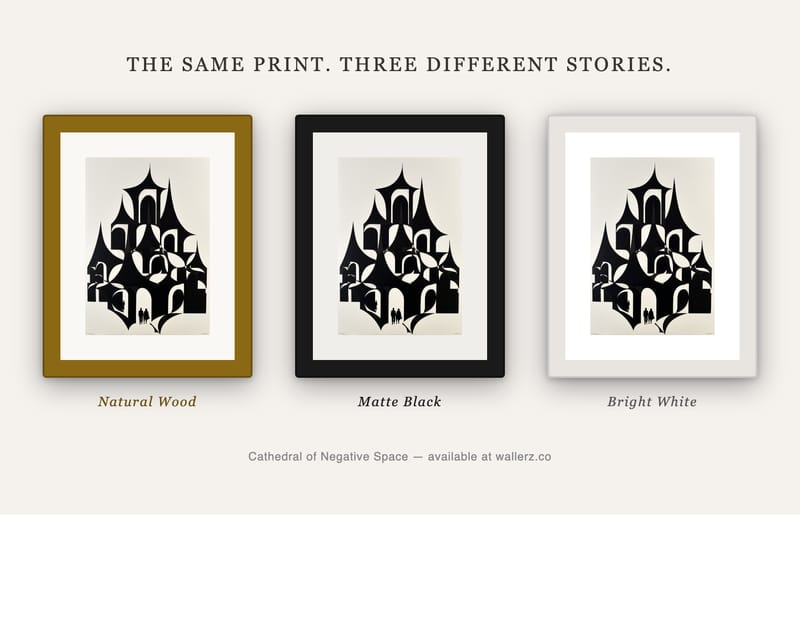
The Wallerz Frame Options
Wallerz ships prints in three frame finishes, each chosen to complement the breadth of the catalog:
- Natural Wood: warm oak-toned frame with a clean profile. Works with almost everything.
- Matte Black: sharp, modern, gallery-ready. Especially strong with bold and graphic prints.
- Bright White: fresh and Scandinavian. Ideal for minimalist, botanical, and soft-toned work.
All framed prints ship ready to hang with hardware included. No assembly, no trips to the frame shop.
Final Thoughts
Framing art prints well comes down to a handful of considered decisions: mat width, glazing, and frame color. Most of the time, a white mat and a frame that either echoes or contrasts with the print's dominant tone is all you need. The rest is attention to the details: flattening the paper, hanging at the right height, using proper hardware.
The print you choose matters. The frame you choose matters almost as much. Get both right and the wall stops being background; it becomes part of the room's story.